Brand and Website Development
BACKGROUND
Finding themselves in a setting where relationships had been replaced by transactions and proactive service was overruled by sales goals, a group of local professionals knew there was a better way. Abiding by their personal values and knowing what clients truly benefit from, they chose to go to market with a business approach that was seamlessly fresh and timeless.
CHALLENGE
Even in the immediate area, financial services companies were plentiful, each with its own positioning and brand promise. With the traditional angles of legacy, acumen, and peace of mind spoken for, we'd need to find a new way to appeal to our client's primary target of business owners. Along with that, they wanted to bring back the joy to their daily work and ensure their clients felt the same way.
SOLUTION
Research and a competitive analysis yielded a key insight: Business owners tend to be good planners with low aversion to risk. Along with that, they often view investments not as risks to minimize but wins to maximize and celebrate. So the key was to develop a brand that recognizes and celebrates the fruits of their labors.
SERVICES:
- Brand Strategy and Positioning
- Name Development
- Brand Development
- Mission, Vision, and Values
- Brand Messaging
- Website Design and Development
- Office-Space Design and Fabrication

NAME AND TAGLINE DEVELOPMENT
After numerous discovery sessions to intimately understand our clients’ motivations, values, and differentiators, the first step was to develop a name the brand could be built upon. While initially deemed too risky, the team leaned into the brand strategy of excitement and reward, selecting "Friday Financial" for the company name. Coupled with that name is the tagline "Let's make plans," which simultaneously highlights the social, relationship-based nature of how they do business as well as speaks to their core focus of offering in-depth financial planning services.

LOGO DEVELOPMENT AND COLOR SELECTION
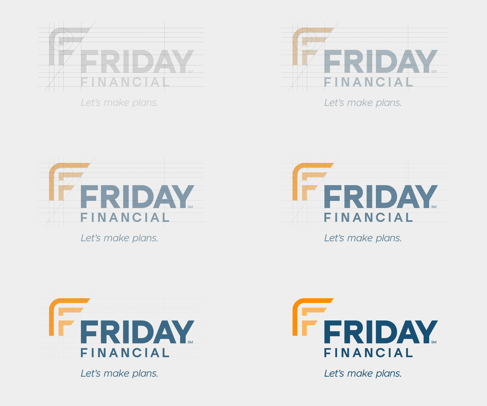
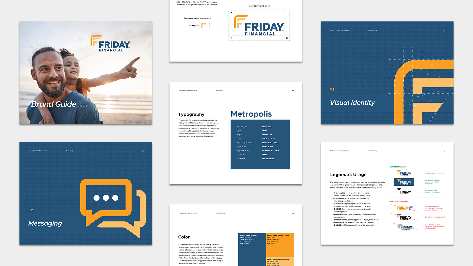
Developing the logo was an exercise in reimagining a commonly used letter while also integrating subtle cues that represent the uniqueness of the company. Two "F"s in the logomark represent the company name, its finishing angles denote upward movement, the rounded arch provides a sense of protection to help dial up the professionalism required in the financial space, and the three individual parts symbolize the three founding partners.
Interweaving professionalism and trust with excitement and energy, the brand has a very complementary nature, and its colors of blue and orange follow suit. They also allude to a sunrise or sunset, helping to communicate a sense of hopefulness and anticipation.

BRAND MESSAGING
As our clients have witnessed, a name like "Friday Financial" is an incredible conversation starter that draws immediate intrigue from prospects. Helping answer the common request to "tell me more about that," we developed brand-introduction messaging and key phrases to illustrate the ethos of the brand.

BRANDED MATERIALS
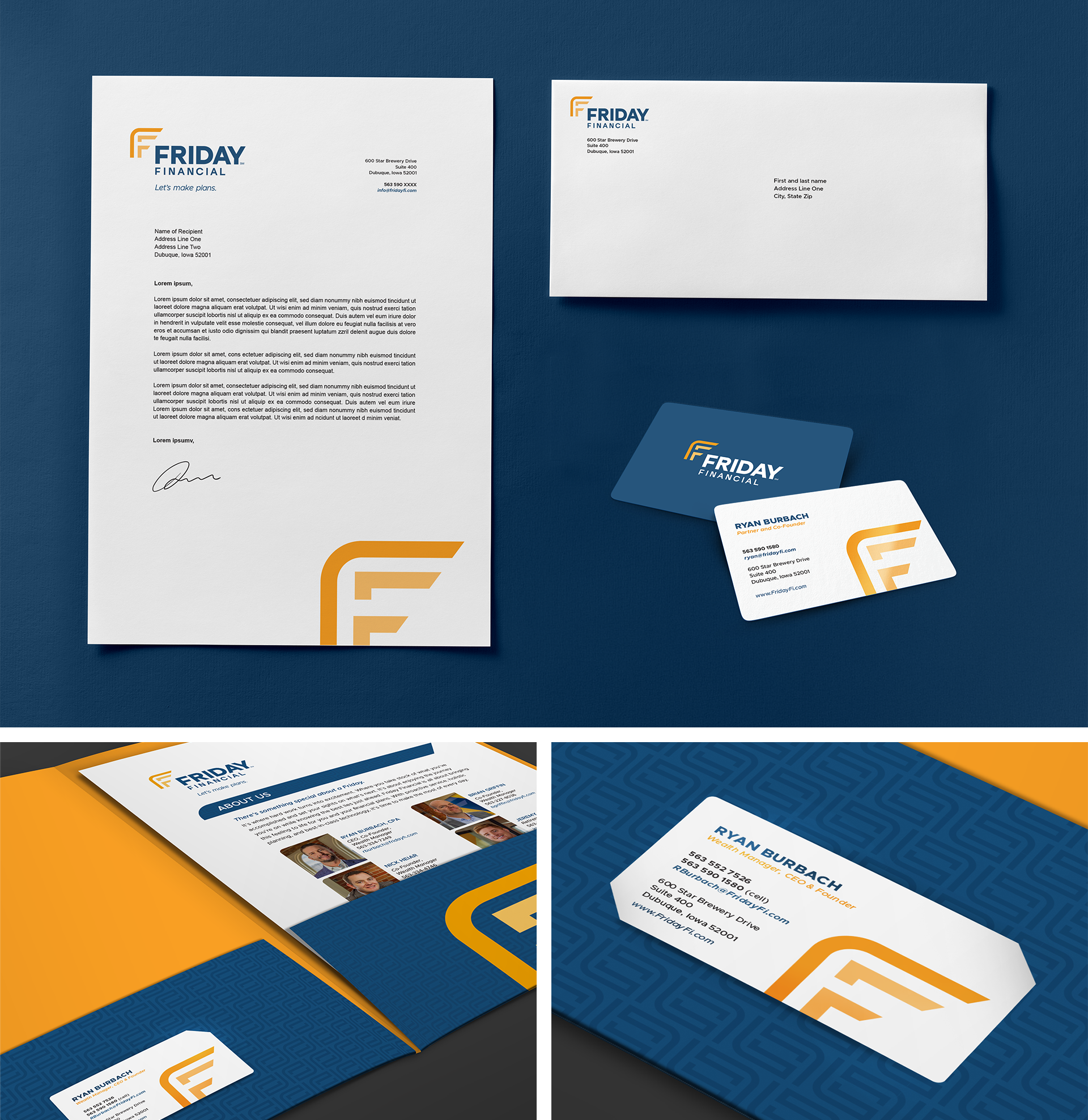
A full complement of stationery, business cards, and other sales collateral came next, each component designed with the purpose of positioning Friday Financial as a premium brand of high repute.
WEBSITE DEVELOPMENT
With the brand fundamentals in place, it was time to build upon them and make them client facing. Expanding upon the client's overall philosophy and offerings, we developed content for, designed, and built a website to strike the perfect balance of educating prospects to the point of intrigue, encouraging them to start the conversation.

BRANDED ENVIRONMENT
Located in the upper level of the historic Star Brewery building in Dubuque, Iowa, Friday Financial possesses a unique office space that needed personalization. We helped the client bring their brand's personality to life through vibrant designs, large-scale wall graphics, and dimensional lettering.

THE RESULTS
Friday Financial has hit the ground running. A bold name, strong brand identity, professional digital presence, and dynamic office space have sent a clear message that the company offers a fresh-yet-proven approach to financial planning. By investing in a premium brand, Friday Financial has grown both its team and its client list in short order, resulting in a strong opening chapter for a company well positioned for long-term success.
